Oklahoma City
Convention Center
Branding a Legacy
Branding // Design // Web Design
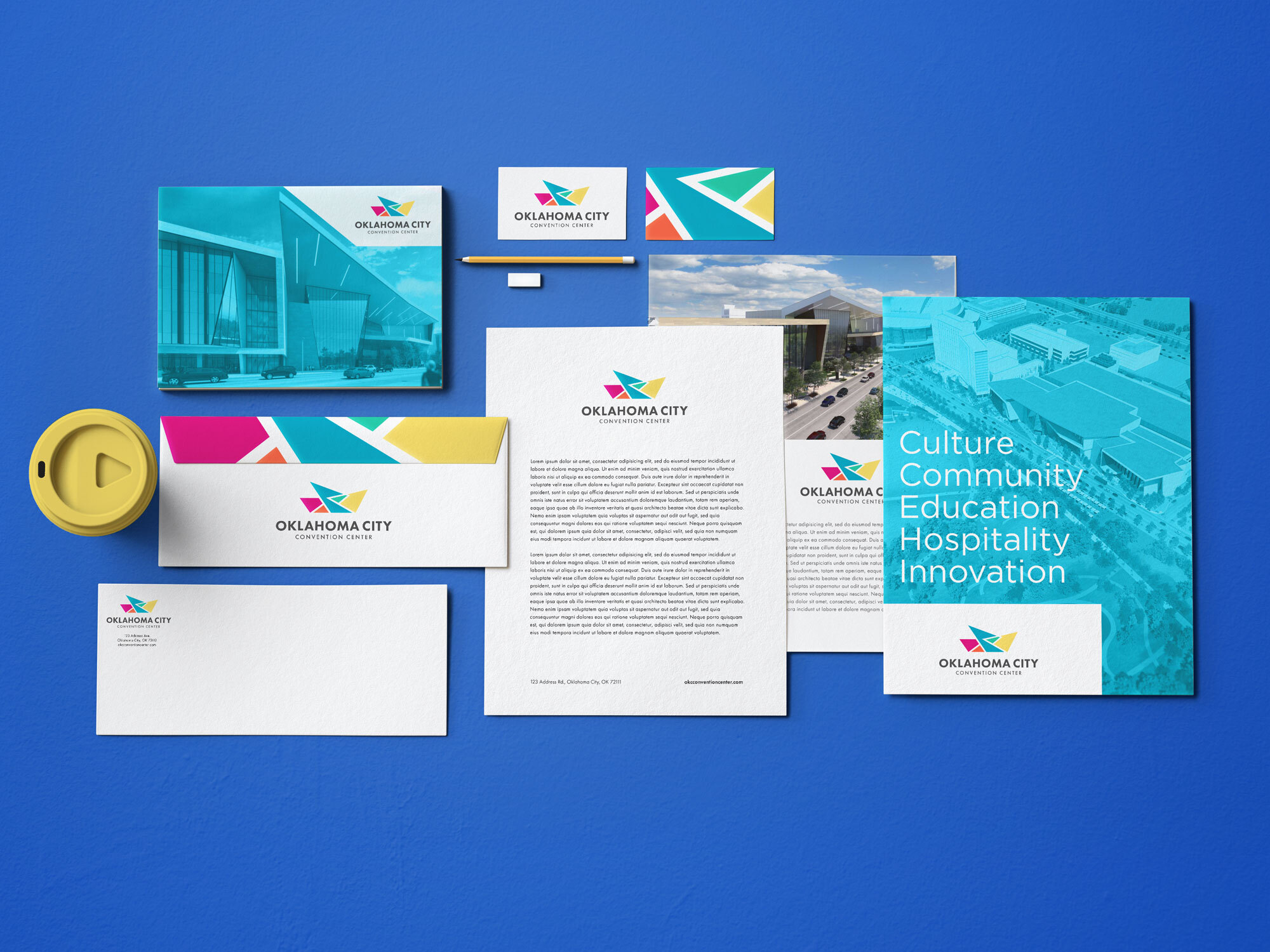
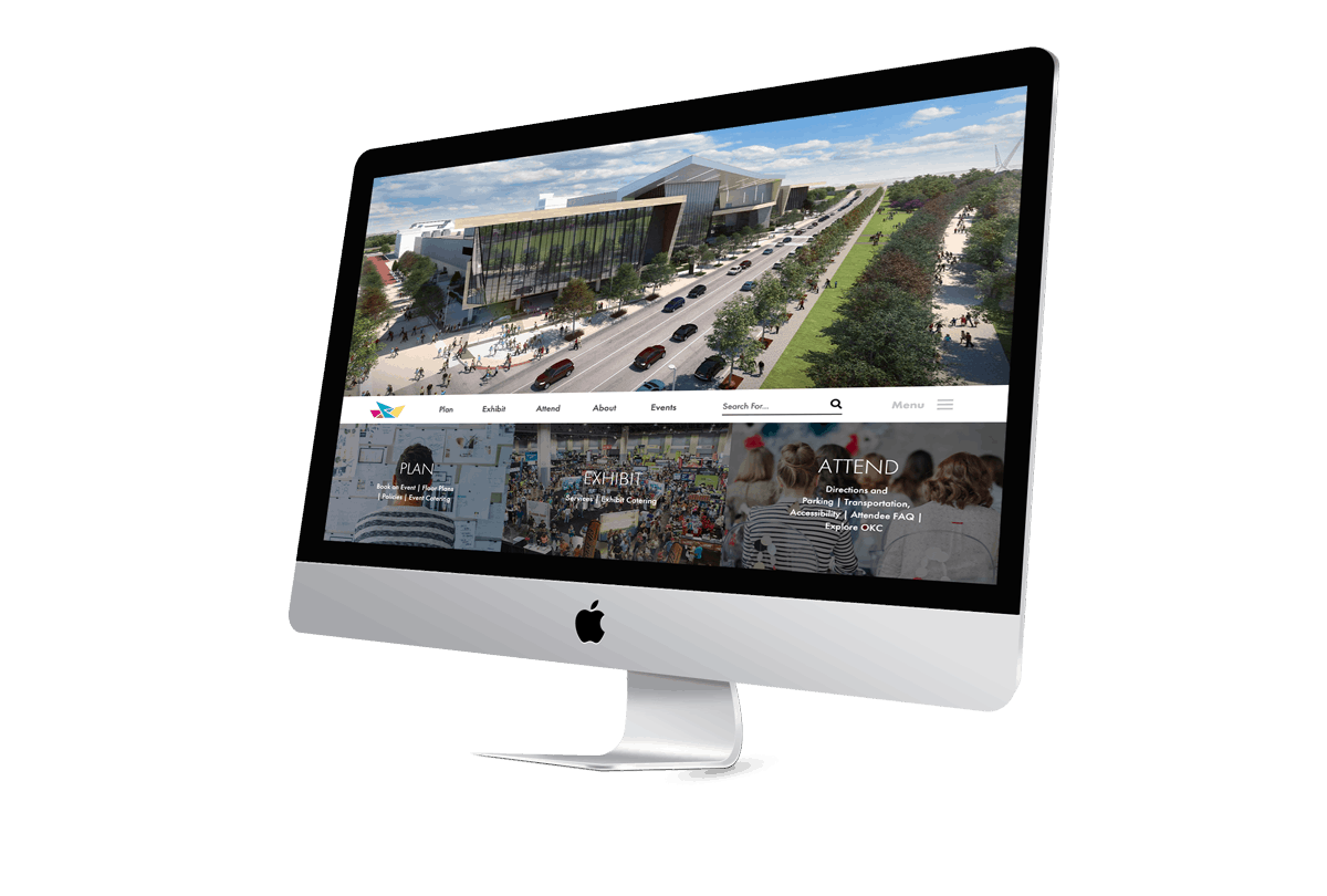
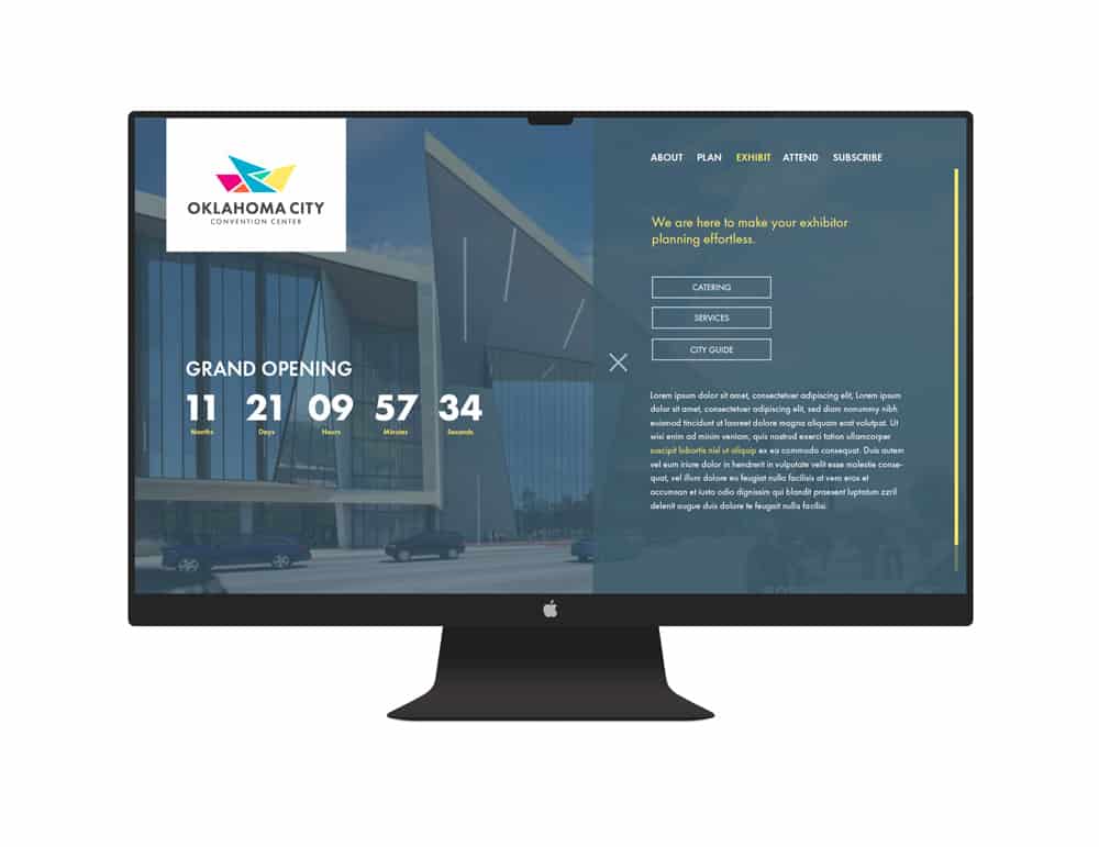
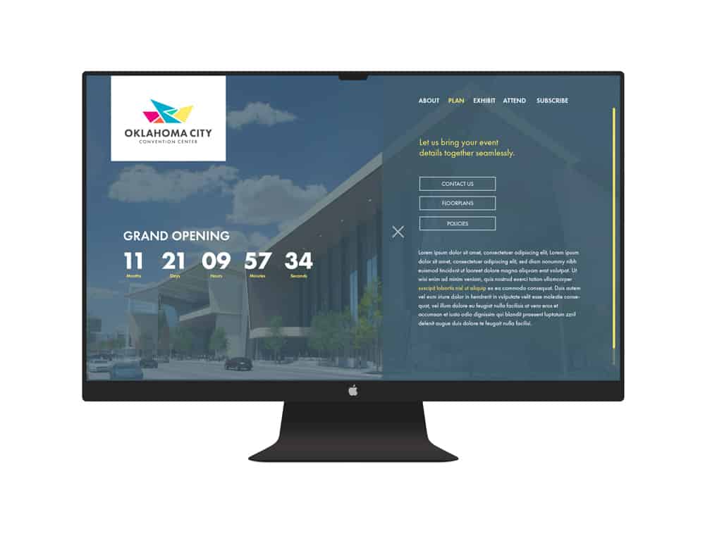
Freestyle Creative was approached to develop branding and a website for the MAPS 3 Oklahoma City Convention Center. The OKCCC branding was built to be bright, energetic, and friendly as a reflection of our community. Each color was carefully chosen to not only pay homage to and complement the facilities and parks surrounding the convention center, but to also give it the power to stand out and be a unique stamp.
There are five colors featured, and each color has an identity. The brand colors represent: Culture, Community, Education, Hospitality and Innovation. The different colors fold together like origami, refolding itself to suit the needs of Oklahoma City’s community as it continues to grow. This brand was designed to grow and breathe, to give future designers and team members the chance to build off of this and evolve to meet future needs.
